Optimizing accessibility on Gettysburg.edu
Gettysburg College wanted to improve accessibility. We analyzed the site, fixed checkpoint failures, changed our internal process, and are building a system of modular components to foster inclusive design.
My digital strategy team worked with our partners in IT to break this challenge down into three phases: triage the site’s UI and critical pathways to fix the most urgent issues; design and deliver training to content producers; and develop and systematize accessible UX patterns to enable a proactive approach to accessibility.
Table of contents
On this page:
User interface and content remediation
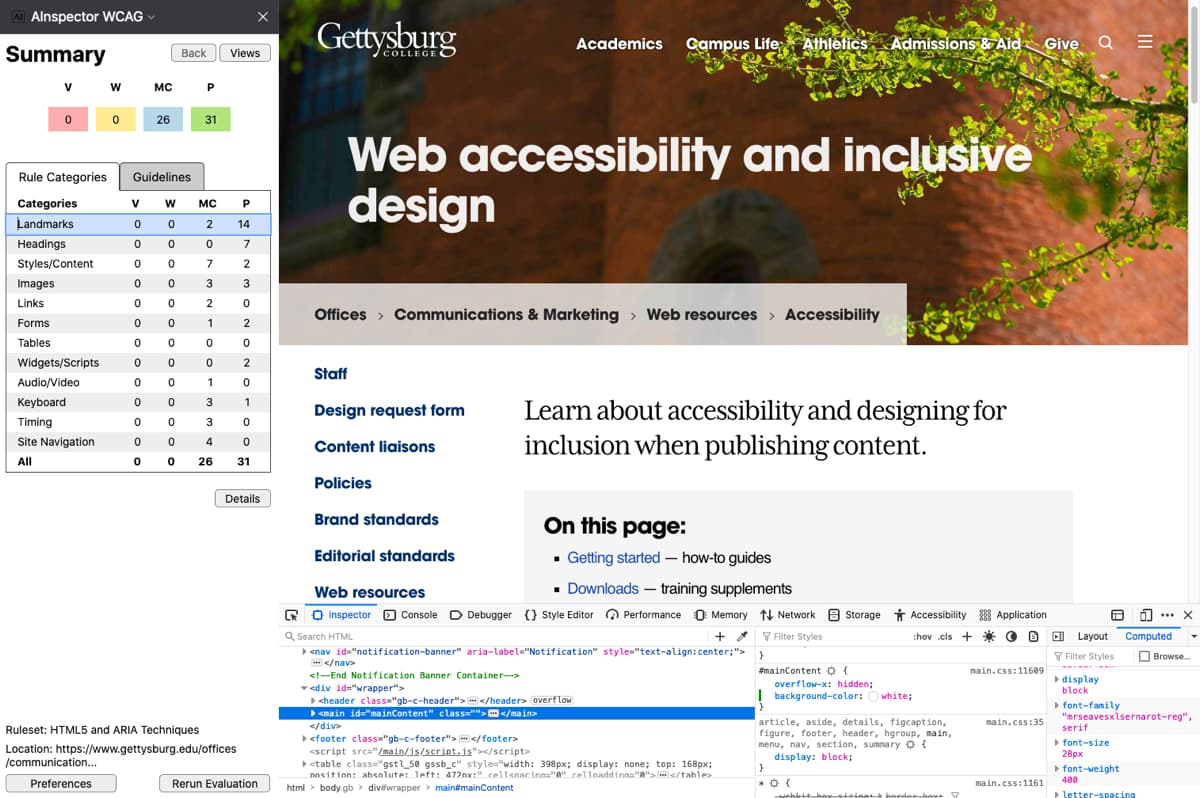
We used automated and manual methods to test the site for compliance with the WCAG 2.0 AA standard, finding four common problems:
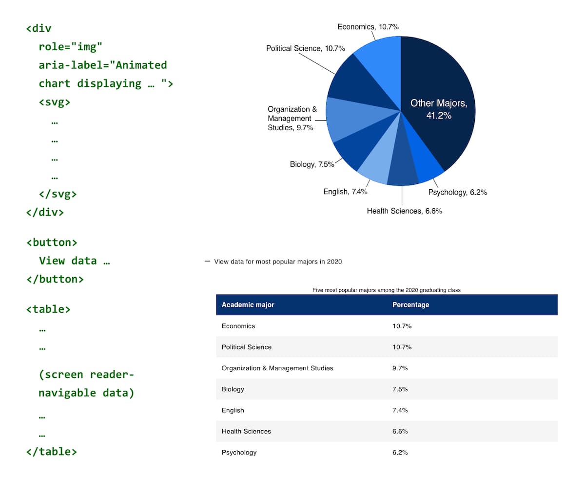
- incorrect ARIA navigational landmarks,
- screen reader issues with forms,
- insufficient color contrast in links, and
- navigation and tagging issues with PDFs.
To resolve these issues, we first remediated the site’s user interface at the template level. We then tracked down business-critical pages and documents that needed to be fixed independently. The initial “triage” of the site took three weeks. Testing is now a routine part of our work.
Contributor training program
The next step was to analyze our digital operations to determine the common sources of inaccessible content. I sought out the underlying business needs driving current practice across the organization, and devised a pragmatic approach to accessibility that staff could incorporate into their existing workflows.
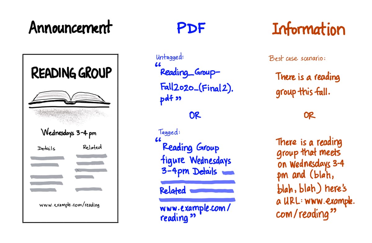
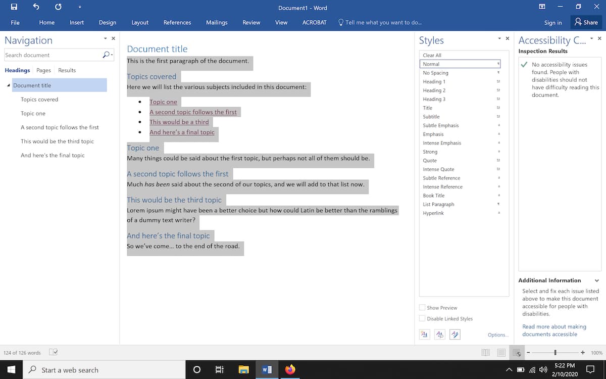
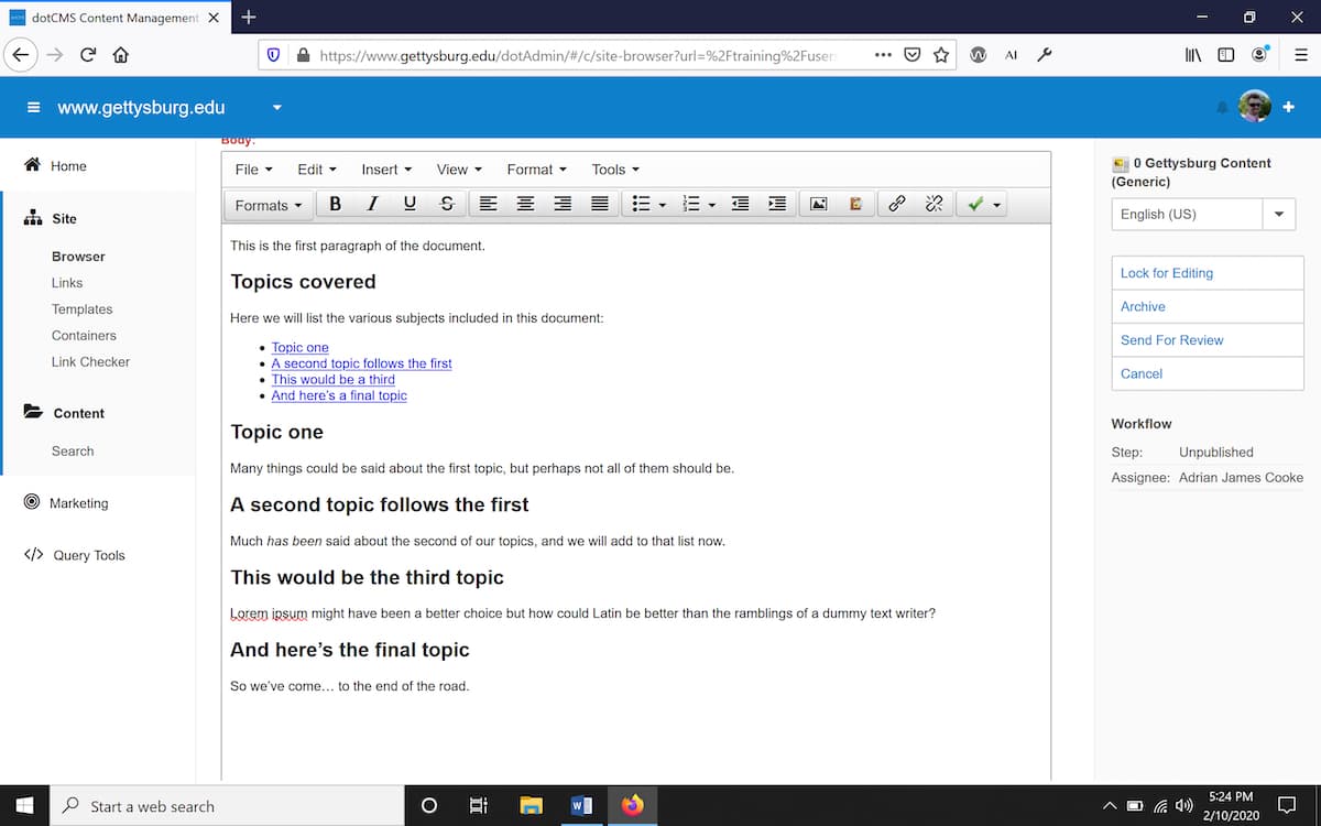
Firstly, I designed and implemented a training program to teach contributors the fundamentals of document structure in MS Word—the source of most of our web content. To encourage contributors to move away from PDFs for web content and forms, we created a PDF-to-HTML conversion process. These practices ensure that new content meets our accessibility standard.
A system for inclusive design
The third phase—currently underway—is to systematize UX components so contributors can meet their business needs using accessible methods. We will define and document a library that enables stakeholders to map specific user objectives with supported, tested, reliable content structures and interaction patterns.
This approach has two benefits: it incentivizes content producers to think about accessibility in the design phase, and—integrated with the right kind of measurement—it also provides a tactical framework for managing other kinds of performance concerns, such as:
- Search Engine Optimization—proper document structure, for example, helps both screen readers and search engines.
- Key Site Interactions—we can ensure user flows through forms are accessible and optimize their components to reduce abandonment rates.