Rebuilding the Syracuse University website
A major content unification project, Syracuse.edu dramatically increased the University’s web signal, boosting search visibility and organic traffic with a fast, mobile-friendly, and accessible flagship website.
Table of contents
On this page:
A new architecture
The launch of Syracuse.edu in 2017 was a major update to the University’s flagship website, designed and executed by the Online Platforms team. As a senior team member, I led research and used our findings to design the site’s information architecture. My role in the project also focused on the CMS migration from Cascade to WordPress, a domain migration from syr.edu to syracuse.edu, a new navigation system, technical SEO, page markup structures, and the development of a new analytics platform and metrics dashboard.
The years before the redesign had seen the creation of many small, independent websites and a movement of content away from the main site (www.syr.edu). Syracuse University was fortunate to have two domain names—the legacy of an early presence on the Internet. The Syracuse.edu project brought this content back home, consolidating dozens of sites into a unified, fast, modern front end using WordPress.
User research
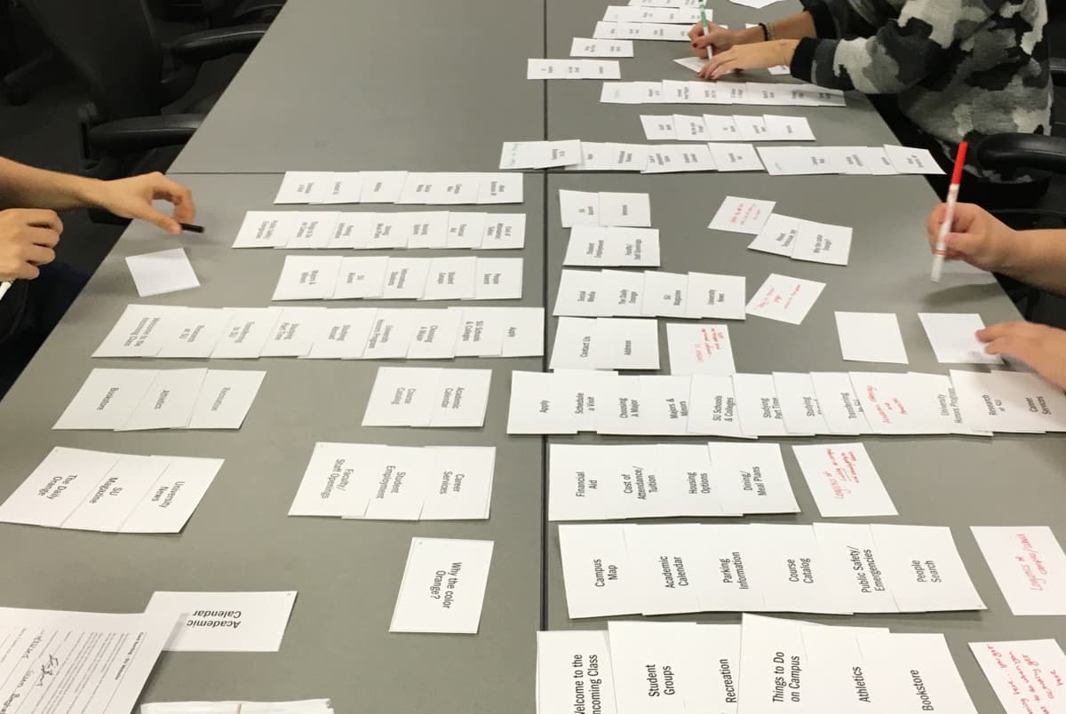
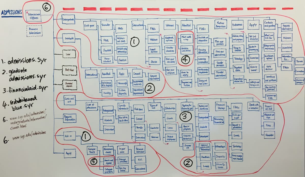
We conducted user research to determine users’ top tasks when visiting the site, the assumptions they make about where and how to find content, and their ethnographic contexts when encountering the site for the first time. Our senior interaction designer and I devised a navigation system and site search feature that were both simplified and emphasized, while keeping way-finding a top priority throughout the design.
Navigation and findability
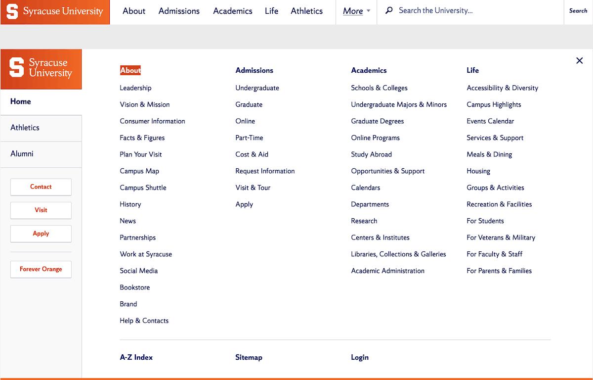
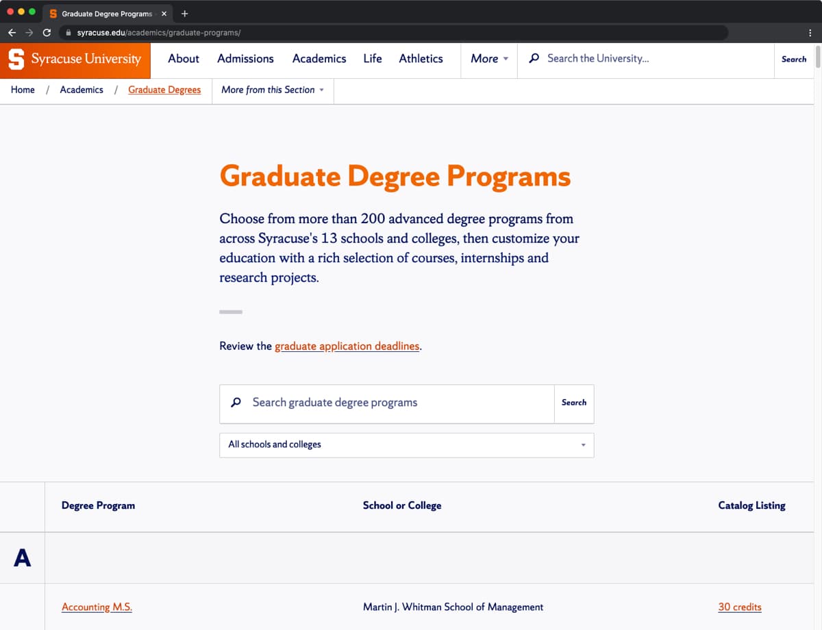
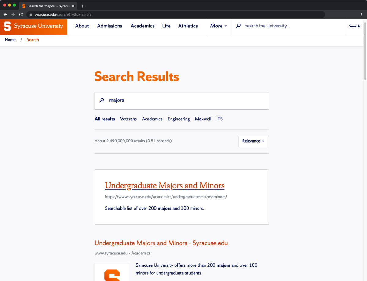
The University is academically diverse and decentralized, with many schools and colleges offering concentrations and degree programs to prospective students. For tasks that required filtering information across such a complex set of options, we provided dedicated search controls and combined them with a structured presentation of data, allowing for fast filtering of results by keyword alone, or by academic unit, carefully crafting usability across varying screen sizes.
For site search I made extensive use of Google Custom Search Engine’s faceted results to provide a brand-wide public search tool that emphasizes results for common searches while allowing users to quickly filter their results as needed.
Better measurement
Measurement was another focal point for this project. Analytics tags on the legacy domain were isolated per site, leading to hundreds of siloed accounts scoped to individual administrative units. For Syracuse.edu I redesigned the tagging system using Google Tag Manager to distribute a global tracker across the web presence, and moved reporting from Google Analytics to a customized dashboard in Google Data Studio. This simplified report provisioning and enabled the inclusion of data from additional sources, including Google Search Console, YouTube, and Google Sheets.
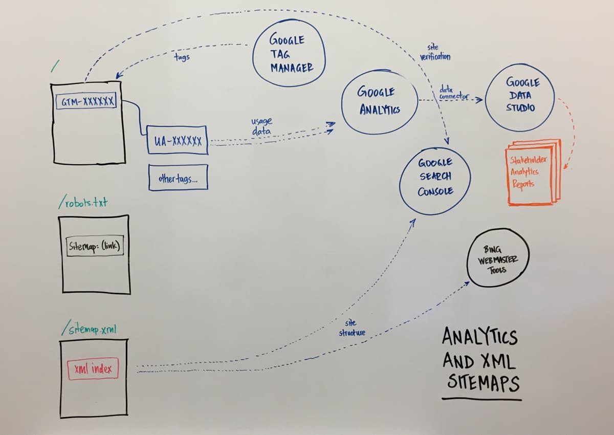
Digital dashboard and SEO
The Digital Dashboard provided the University’s first global reporting system for digital analytics. Our team’s platform operations specialists distributed the container across hundreds of legacy sites, enabling a centralized mechanism for tag management and capturing web session data at scale. I designed the first version of the report to break down acquisition sources, search keywords, campaigns, and site behavior for traffic across the web presence. A filtered list of unbranded search queries was included on the summary screen (i.e. on the first page) to raise awareness of the importance of organic traffic, and to surface content that gained traction with a general audience.
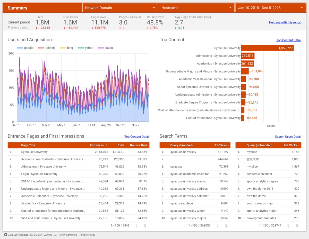
Supplemented with data from Moz, the Dashboard allowed the marketing team, as well as stakeholders across the organization, to see the impact of site consolidation on visitor traffic and the increasing visibility of our content in search results. Importantly, this tool enhanced the organization’s ability to measure SEO successes and uncover new opportunities, such as specific majors (e.g. “sport analytics major”) which came to rank at the top of results and won a featured snippet in the first year.